Welcome to the documentation for the MagSoul WordPress Theme. This guide covers the free MagSoul 1.0.5 theme.
MagSoul is a responsive magazine and blog theme that presents posts in a six-column desktop grid which progressively adapts to smaller screens. It includes a full-width one-column content layout, two responsive navigation menus, extensive header-image controls, footer social links, four post share buttons, and twelve widget areas.
Quick Start Guide
- Install & activate the theme via Appearance → Themes → Add New.
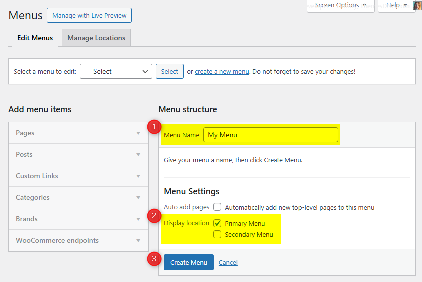
- Set up your menus by going to Appearance → Menus. Create a menu and assign it to one of the available menu locations.
- Configure widgets by going to Appearance → Widgets. Add widgets to the available widget areas.
- Customize by going to Appearance → Customize → Theme Options. Set up your social links, header options, posts summaries options, and more.
Theme Features
- Responsive Design
- Six-Column Desktop Posts Grid
- Full-Width, One-Column Content Layout
- Sticky Header with Separate Small-Screen Control
- 2 Navigation Menus (Primary and Secondary)
- 12 Widget Areas, including 4 Footer Columns
- 67 Social Profile and Contact Links
- 4 Post Share Networks (Pinterest requires a featured image)
- Custom Logo Support and Logo Placement Options
- Custom Header Image with Detailed Display Controls
- Custom Background
- Author Bio Box
- WooCommerce Gallery Zoom, Lightbox, and Slider Support
- WordPress Editor Styles and a Default Button Block Style
- Yoast SEO Breadcrumbs Support
- RTL Language Support and Translation Ready
- Back to Top Button
- Loading Animation
- FitVids.JS for Responsive Videos